Member-only story
Examining the Drawdown Risk of Sector ETFs — 2022

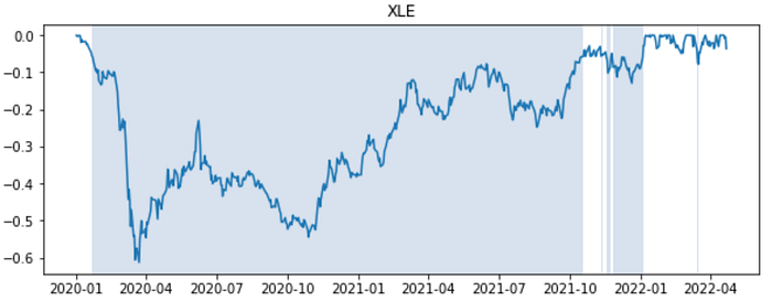
A drawdown measures the distance (in %) of the portfolio value from its peak, reflecting its downside risk. If a portfolio had previously reached a peak of $100 and subsequently dropped to $90, then the portfolio experienced a 10% drawdown.
We examine the drawdown risk sector by sector through a collection of Sector ETFs over the period 1/1/2020–4/22/2022. As we will see, drawdown risk may vary greatly in terms of magnitude and duration across sectors.
To start, we look at the drawdown charts for the S&P500 ETF (SPY) and Nasdaq ETF (QQQ). It’s visible that QQQ has experienced more frequent drawdowns (of 5% or more), and it’s currently mired in a deep drawdown.

Next, we compare at the Financial Sector ETF (XLF) and Tech Sector ETF (XLK). Naturally, XLK’s drawdown chart looks similar to QQQ’s (above).

The energy (XLE) and utilities (XLU) sectors are doing relatively well after a long period of drawdown since 2020.


The Consumer Staples sector has shown persistent momentum. Due to its non-cyclical nature, the sector is often perceived as a safe haven through uncertain market conditions. A related sector is the building/industrial materials sector (XLB), which has experienced multiple periods of significant drawdown in the past year.

Lastly, gold has been widely perceived as a safe-haven asset and a good hedge against inflation. However, gold has seen a lot of ups and downs, and…
